Free to create · 3-day trial · Pay only if you love it
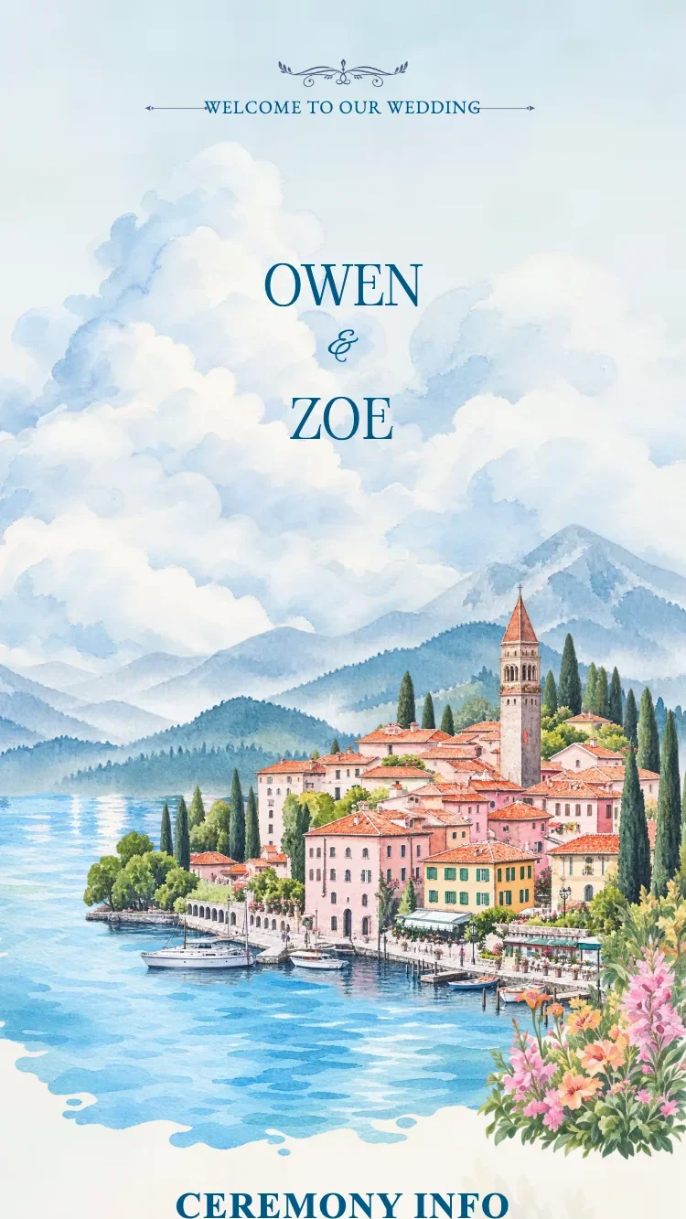
Riviera Blue opens as a watercolour painting. A still blue lake fills the lower half of the cover, hazy mountains stand behind it, and a Riviera village leans into the hillside with terracotta roofs, dark cypress trees and a bell tower rising through the middle of the scene.
The Riviera is the warm strip of shoreline along the Mediterranean, where pastel villages sit at the waterline under the hills. Painting that in a watercolour hand keeps the card light and open, a landscape rather than a dense ornamental pattern. Every line of type uses just two blues, a pale lake blue for the headings and the couple’s names, a deep navy for the body.
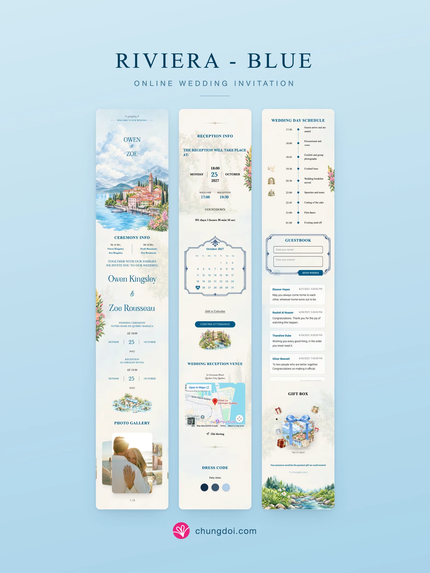
Further down, hibiscus and snapdragon sprays bloom off the edge of the card, a wooden rowboat rests on a bed of stones in the water, and a small stone bridge sits just under the RSVP button. The mini calendar and the guestbook each sit inside their own hand-painted frame drawn for this design.
The card carries the full feature set: both families’ details, the announcement, ceremony and reception details, a countdown, a 3D flip photo album, Google Maps, a dress code, a wedding-day schedule with three painted medallions (a dove, a garden gate, a fountain), a guestbook, and its own gift box and envelope painted to match.
A gentle choice for couples drawn to blue wedding invitations, to floral art and to garden scenery rather than to dense classical ornament.
It is a Riviera village on a mountain lake: terracotta roofs, a line of cypress trees and a bell tower rising out of the hillside. The Riviera is the warm Mediterranean shoreline, so the scene carries a holiday feeling, unhurried and full of light, which suits a relaxed wedding.
Chateau Blue is built around one grand European mansion and reads formal and composed. Riviera Blue is a landscape instead: the lake takes nearly half the cover, a small village sits along the hillside, and flowers spill off the edges. It is lighter and more everyday, and it suits an outdoor reception.
The dress code swatches are yours to pick in the editor, and you can add or remove them. The two blues used for type are part of the design and stay fixed, so the text keeps its contrast against the watercolour behind it.
It defaults to the 3D flip album: the current photo sits in front, the rest fan out at an angle on both sides, and guests swipe to move through them. You can switch it to a grid or a masonry layout in the editor, and tapping any photo opens it full screen.
Yes. It ships with a gift box painted from the same garden and stream as the card, plus a matching envelope illustration if you choose the envelope display mode. Inside sits each family’s bank details or QR code.
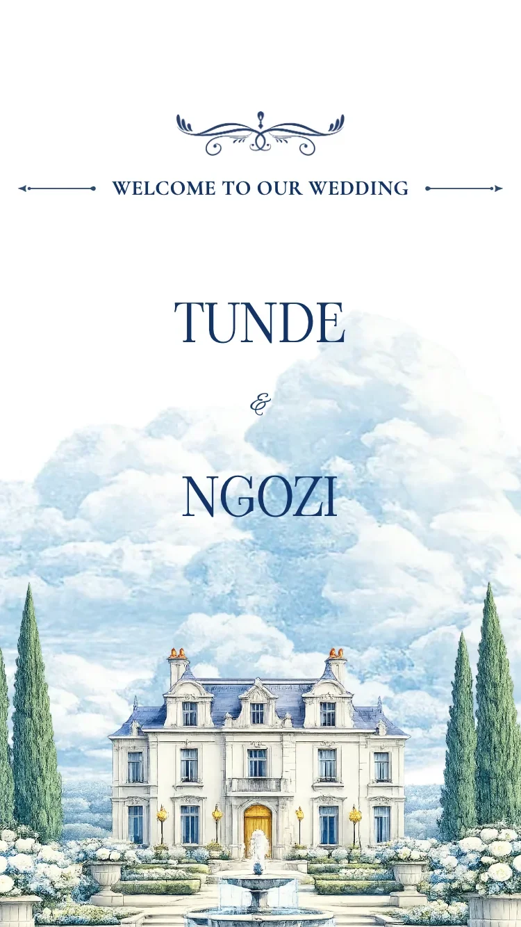
European chateau hero, deep blue on white, Cormorant + Viaoda Libre typography. Romantic, elegant western wedding feel.
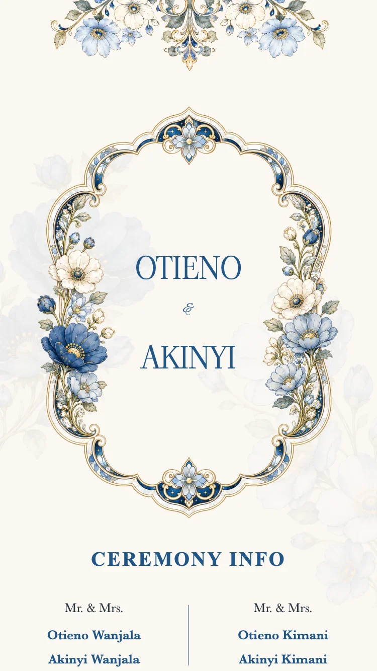
Crystal-textured florals and a porcelain-blue frame on warm cream, with deep porcelain blue accents. Fresh, elegant European blue wedding feel.
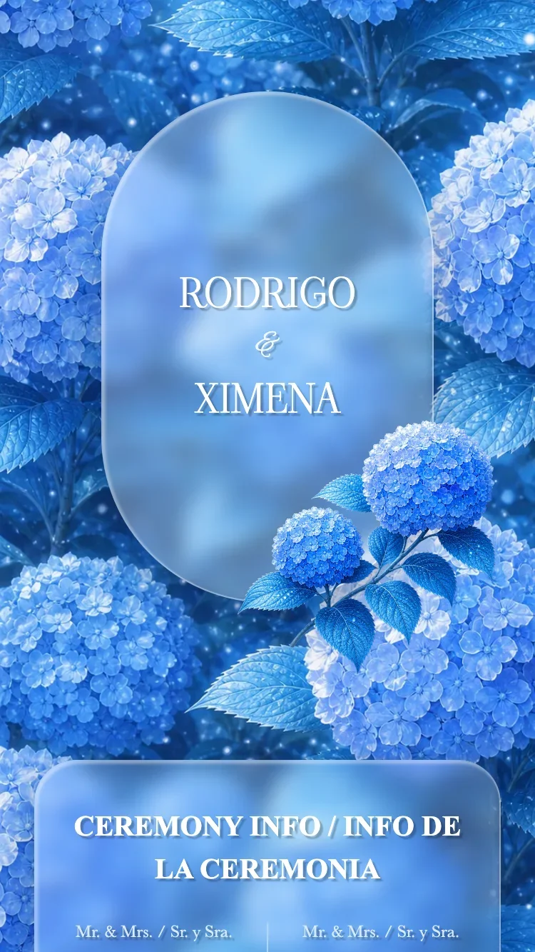
Layered blue hydrangeas fill the whole card, the names sit inside a clear arched glass frame, and a large glass panel wraps the content. Cool azure tones with crisp white lettering for a dreamy garden feel.
